Amar Ujala – Redesigning the My City Selection Experience
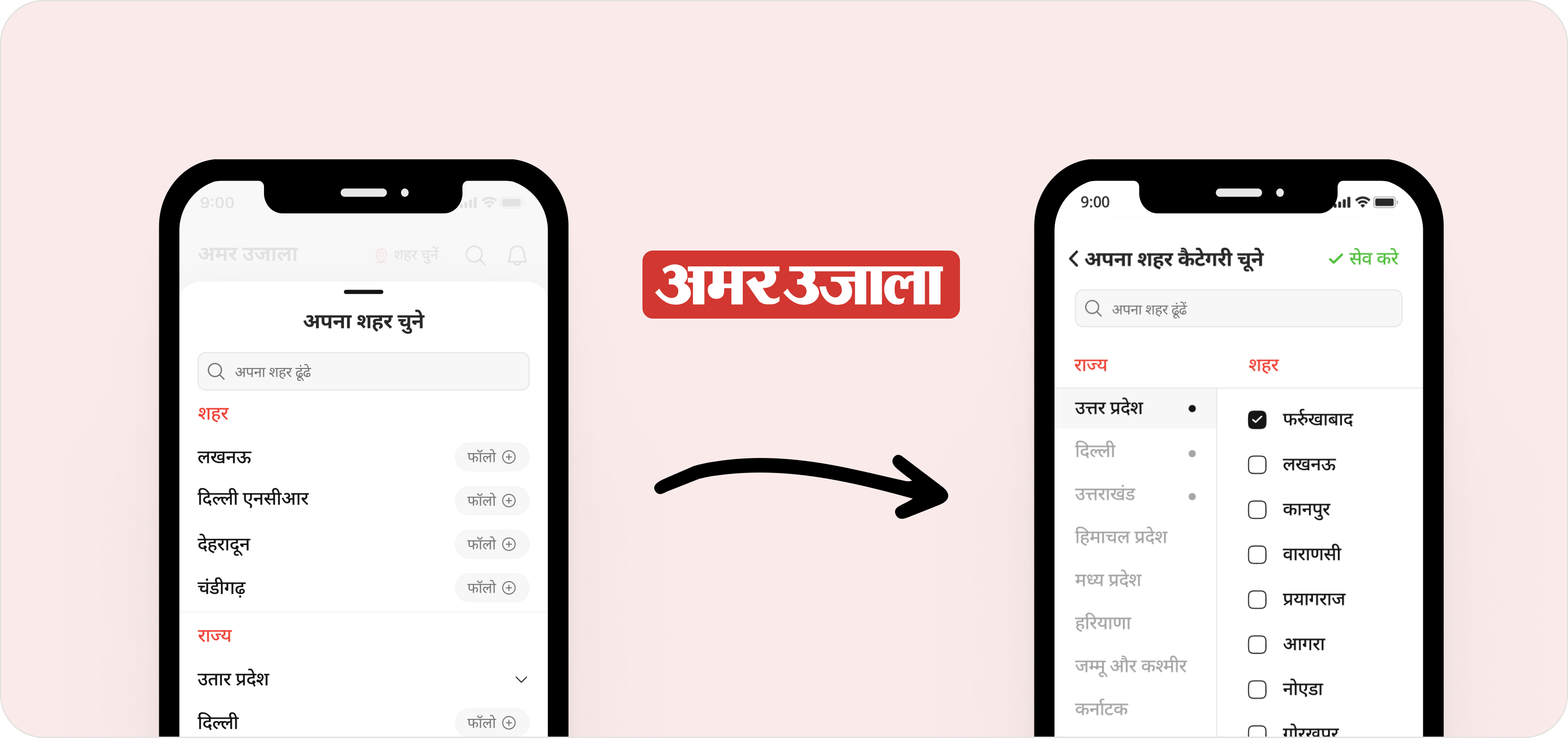
Transforming a Shallow Filter into a Structured Preference System
While working at Amar Ujala, I was exploring the app as part of a broader product audit when I noticed friction in a critical flow:
Selecting your preferred city to read news
At first glance, it worked. But from a product thinking perspective, it was shallow.
The Problem I Identified
There was a CTA on the top header: “शहर चुनें” (Choose City). When users tapped it, they landed on:
Users tapped it, they landed on:
- Long static city list without categories
- No clear state hierarchy or grouping
- Similar city names mixed together causing confusion
- No way to select or follow multiple preferred cities
- No explicit save confirmation feedback
From data:
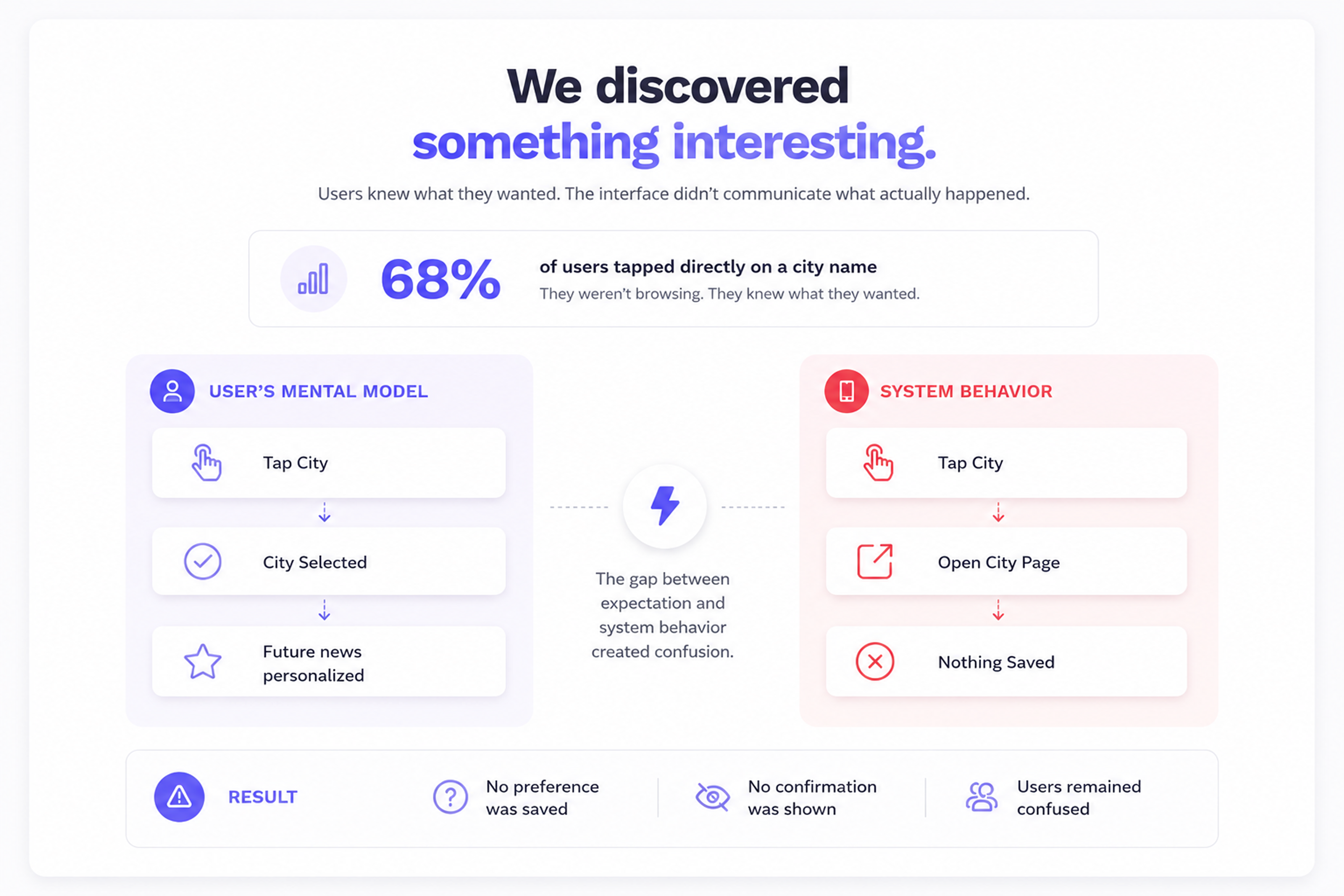
- ~68% tapped directly on city name expecting filtering
- Redirected immediately instead of saving preference
- Users were unsure if their selection was stored
- Many assumed it saved but got reset on next launch
- Tier 2/3 users expected a simple “tap once” model
“So yes — the intent was clear. If someone wanted Noida news, they clicked Noida.”
But here's the deeper issue:
The feature was supposed to act as a preference filter system, yet it was behaving like a navigation shortcut but there was no structured way to:
Stakeholder Collaboration
I discussed this observation with Zahid Qurashi (Sr. Product Manager at Amar Ujala).
Instead of jumping into UI changes, we went deeper into metrics:
- Click behavior across city drop-down CTA
- Drop-off analysis on location selection pages
- Session patterns after city redirection
- Heatmaps on state navigation lists
- Navigation loops between home and local feeds

Research Phase
We expanded research in three directions:
Surprisingly, direct competitors weren't solving this elegantly either.
That was encouraging.
But we didn't want to redesign based on ego.
So we broadened the scope to study:
- Filtering systems in e-commerce apps
- Category selection flows in content platforms
- Preference selection patterns in news & media apps
The Strategic Shift
We reframed the journey:
The New Solution (Second UI Iteration)
Clear State → City Segeration
Left Panel: State / Right Panel: Cities Under selected State
Selection Based Model
Checkboxes instead of direct redirect. Multi-select Enabled
Confirmation Layer
“Save” CTA / Preview of selected cities
Validation – UAT & A/B Testing
We conducted: UAT with 100+ participants
- Mix of existing AU users and non-users
- Different reader personas & age groups
Initial reactions:
- Existing users: “Feels different and modern.”
- New users: “Much clearer.”
Results showed:
- Stronger clarity in preference selection
- Higher interaction depth on city feeds
- Better structured engagement across regional categories
However, post-launch clarity recordings revealed something important: 20–30% of existing users initially found it slightly confusing. But after first interaction, adaptation was smooth. New users navigated it naturally. This was a critical learning moment.
The Real Product Decision
Post-deployment data indicated:
- Increased structured preference usage
- More multi-city selections per user
- Reduced shallow redirects
- Improved retention within selected city feeds
Key Learnings
Users were completing tasks, but the product was underutilized.
Direct city redirection was easy, but not scalable.
- Disrupt muscle memory
- Risk initial friction
- Face internal resistance
- Sometimes pushing UX forward is necessary
New users adapted instantly. Existing users needed subtle guidance. Microcopy and transition design matter.
My Growth From This Journey
This wasn't just a UI redesign.
It was:
- Stakeholder alignment & cross-functional persuasion
- Data-backed decision making
- Risk-managed UX evolution
- A/B validation under real traffic scale
- Post-launch behavioral analysis
It strengthened my ability to:
- Challenge existing flows respectfully with data
- Use metrics to guide holistic redesign
- Think systemically across multi-city platforms
- Balance innovation with adoption friction